
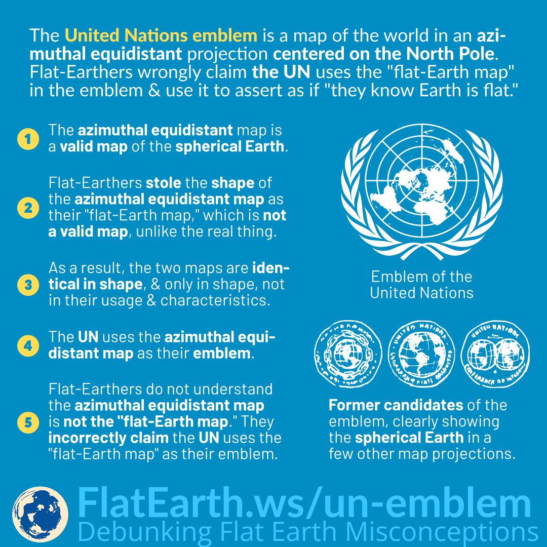
The flag and emblem of the United Nations is a map of the world in the azimuthal projection centered on the North Pole. Flat-Earthers wrongly claim that the UN uses the so-called “flat-Earth map” in their emblem and use it as “evidence” that the UN “knows Earth is flat.”
The azimuthal equidistant map is a perfectly valid map of the spherical Earth, and it is used for many purposes if the task at hand calls for it.
Some flat-Earthers noticed an azimuthal equidistant map centered on the North Pole and stole it as the shape of their own “flat-Earth map.” Unlike the map they are stealing from, the so-called “flat-Earth map” is not valid. The real azimuthal equidistant map is just a projection of the spherical Earth on a 2D medium, while the so-called “flat-Earth map” is a scaled-down version of the purported “flat-Earth” and claimed to be distortion-free.
As a result, both the azimuthal equidistant map and the so-called “flat-Earth map” are identical in shape and only in shape, but not in their usage and characteristics.
The United Nations decided to use the azimuthal equidistant map centered as the North Pole as their emblem, which is not the so-called “flat-Earth map” but having the same shape.
Flat-Earthers cannot understand that the azimuthal equidistant map is different from the “flat-Earth map” and incorrectly claim the UN uses the “flat-Earth map” as their emblem.
When the United Nations first created its logo, there are several candidates to choose from. Some depict the Earth in different map projections and clearly show that the Earth is a sphere.
References
- UN Logo and Flag – United Nations
- The Architect Who Designed the UN Logo – United Nations Blog
- Origin of the Emblem and other Recollections of the 1945 UN Conference – United Nations
- Maps, Flags, and Boundaries – Research Guides at United Nations Dag Hammarskjöld Library
- Origin of the Emblem and Other Recollections of the 1945 UN Conference – Donal McLaughlin